Wednesday, March 11, 2009

Lighting Sketch Series 4-Lamps


Lamps


A perfect fit for the bottle lights, super bright, direct, long-lasting, and cool fixtures.


HID Exterior Lighting
A good fit though I think LED's could have achieved the same effect.


Fluourescent Lighting
A budget conscious choice though cold cathodes or LED's would make a better fit for a permanent installation.

Cold Cathode Interior Lighting
Fantastic fit! Could also be achieved with traditional fluorescents or LED's but I think the versatility of the cathode and seamless appearance and dimming ability make it more suitable.

Cold Cathode Exterior Lighting

Incandescent Interior Lighting
Not a good lamp for the office of a designer. The color rendering is off, the room is dimly lit at night and everything is washed in a warm tone making it hard to read blues correctly. A more appropriate light would be a GE reveal white light incandescent, or a halogen.


Halogen Interior Lighting
Great for ambiance/candle lit look in a bedroom. There is enough day light that we don't need over heads during the day, and we prefer dim lighting at night. Perfect for our bedroom.

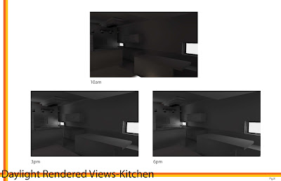
Day Light Model


The optimal positioning is the ribbed wall facing south. This provides a clear way finding pathway of light. This position provides maximum sun exposure. The west includes a thin linear opening and bevelled window illuminated by afternoon and evening light. The arched light shelf/skylight controls day light and provides the directional tool. The east side is for viewing the model and the North side is a flat wall to catch light and shadow. We achieved multilateral lighting through 4 openings and the curved light shelf diffuses light through the space. Inspiration cam from: Jorn Utzon-the curved shelf  and curved structural pieces.
Calatrava-sculptural elements, and light reflectance through staggering structures.
Le Corbusier-small bevealed opening as seen in the Ron Champ Chapel

Sunday, February 22, 2009

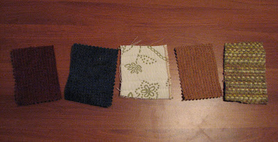
Nomadic Swatches

Kernersville Library
Traditional Fluorescent Lights between stacks.
Very bright and good for reading but washes out the colors.


FoodLion Fluorescents-Newly Renovated
The store has sparsely spaced semi-direct hanging fluorescent fixtures. They provide white light and the store overall has a medium level of brightness to make it more inviting. The color rendering is pretty good, though the cools look a little more vibrant.


Home Office-60Watt Incandescent
The swatches are washed in yellow and the shadows of the textures is more prominent. The white looks cream.


Roses-Old Skool-Fluorescents
The colors are dull and seem to have a darker hue, they overall look dingy like the store. The lighting is sunken in yellowish panel fluorescents.