Sunday, February 22, 2009

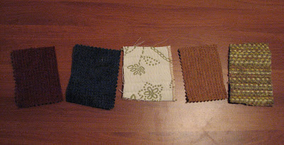
Nomadic Swatches

Kernersville Library
Traditional Fluorescent Lights between stacks.
Very bright and good for reading but washes out the colors.


FoodLion Fluorescents-Newly Renovated
The store has sparsely spaced semi-direct hanging fluorescent fixtures. They provide white light and the store overall has a medium level of brightness to make it more inviting. The color rendering is pretty good, though the cools look a little more vibrant.


Home Office-60Watt Incandescent
The swatches are washed in yellow and the shadows of the textures is more prominent. The white looks cream.


Roses-Old Skool-Fluorescents
The colors are dull and seem to have a darker hue, they overall look dingy like the store. The lighting is sunken in yellowish panel fluorescents.


Wednesday, February 11, 2009

Light Sketch Series 2


The Childrens Museum
The lighting in the museum is theatrical. There are colored films used over incancesdents and halogens. There are large fluorescents used for uplighting, and direct down-lights fluorescent and halogen in areas where more lighting is required.. The uplighting exposes all the systems of the building and the bright fluorescents at the end of hallways help to light the way to the destination of offices. Warm lights were used inside of playhouses, and cool blue was used in a water scene, the green bean stalk is lit with green and red lights, the grocery store in bright fluorescents, the art room in fluorescents, and the arthur exhibit had alot of natural light washed in. There were windows all around the perimeter of the space, and some windows from the ground up to about 4', perfect for a childs view.


Pacific Sunwear in Hanes Mall

The lighting designer had actually just come in the store and made some quick changes, in the first picture notice 6 track lights, and the second picture only 4 halogen track lights. The look they are going for is intimate, with spotlighting only on clothes and mannequins.  


6th and Vine
Bar and Restaurant
Most all the lights in this restaurant and bar are incandescent around 40-60 watts. There are halogen lights over the bar, but I am unsure of the wattage.


Friday, February 6, 2009

Lighting Evaluation


Shadows

Spot Lights

Indirect Lights

No Lights

Indirect and Spot Lighting


Spotlighting


No Lights/Emergency Only


Spot/Indirect


Indirect Overhead Lighting


 Team Description Summary:

The space’s intended function is a student lounge but its mostly used as a cut through to the vending machines. There are several lighting options, but the space is usually indirectly light with overhead fixtures creating a dimly lit space. The room is adequate in size for its intended use, and can be perceived as intimate or public depending on current use. The lounge feels neglected and is often unused.


The Analysis:

            Primary Use:

                        Study and breakroom(eating and socializing)


            Lighting:

1.     No lights-Emergency Lighting only

-very dim

-some filtering of natural light through door and electric light from locker and vending room

-floods of low light/feels very enclosed or small/glare floor more noticeable

 -simply for relaxation-sleepy time

-low shadow

                        2.  Indirect Overhead Lighting

                              -makes room tall and skinny

                              -makes you sleepy-brings eye up-majority of light on ceiling and                                              top 4ft. of wall

                              -filtering of outside lights  less apparent

                              -minimal glare on floor

                              -more inviting than spot light for relaxation purposes-sleepy time

                              -low shadow

                        3.  Spot Light

                              -room looks wider and shorter

                              -edges are highlighted and center is dim

                              -spot lights also highlight product/furniture projects

                              -high shadows

                              -Very glaring white spots-due to lack of artwork

                              -accentuates wall blemishes and makes room look dirty

                              -uninviting-little more stimulating

                        4. Both-Spot and Indirect

                              -high Shadows

                              -indirect levels cancels out intensity of spot lights

                              -room is brightest with these lights

                              -more focus and awake feeling

                              -more conducive to socializing and learning

                              -eye less drawn to ceiling

                              -less aware of room details-more on the purpose of the room

                              -hotter with all lights on


Intimate or Public Scale:

            -Public:

-used as a cut through to bending and lockers

            -Intimate public mix:

-enclosed space w/intimate seating options

            -Public View area:

                        -tv and artwork


Overall Impression:

            -uninviting-forgotten space-makes you feel like an intruder or as if you are interrupting something private if people are using the space

            -not good for large group meetings


Other Info:

            -Title:Student Lounge

            -Location:2nd Floor-btwn 204 and vending

            -Stuff In Room:

                        -2 furniture projects

                        -trash and recycling bins

                        -table for flyers

                        -Big tv

                        -Clock with wrong time